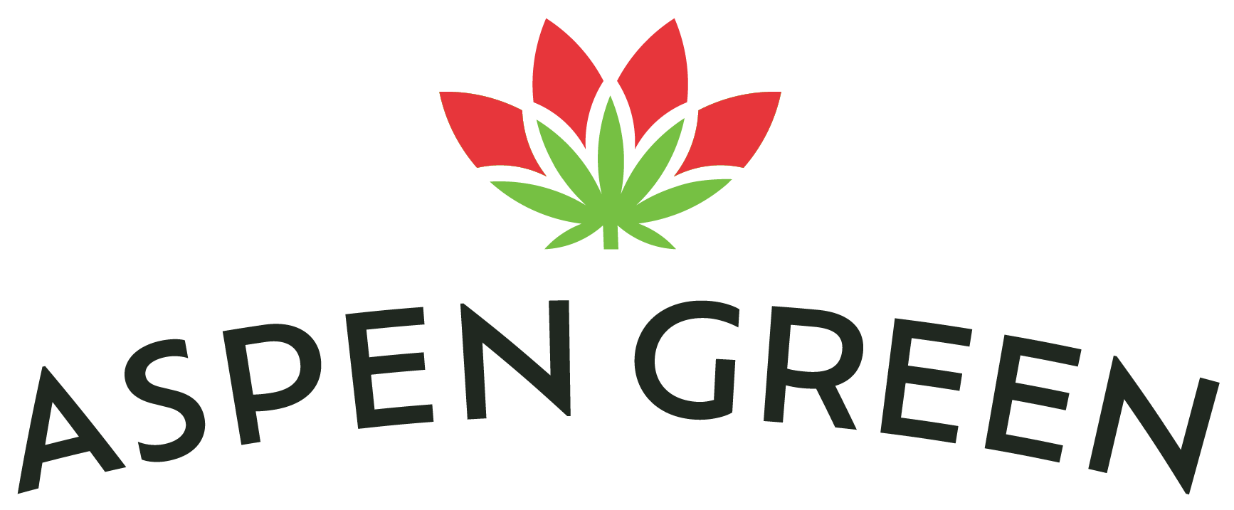
ASPEN GREEN
-
Challenge
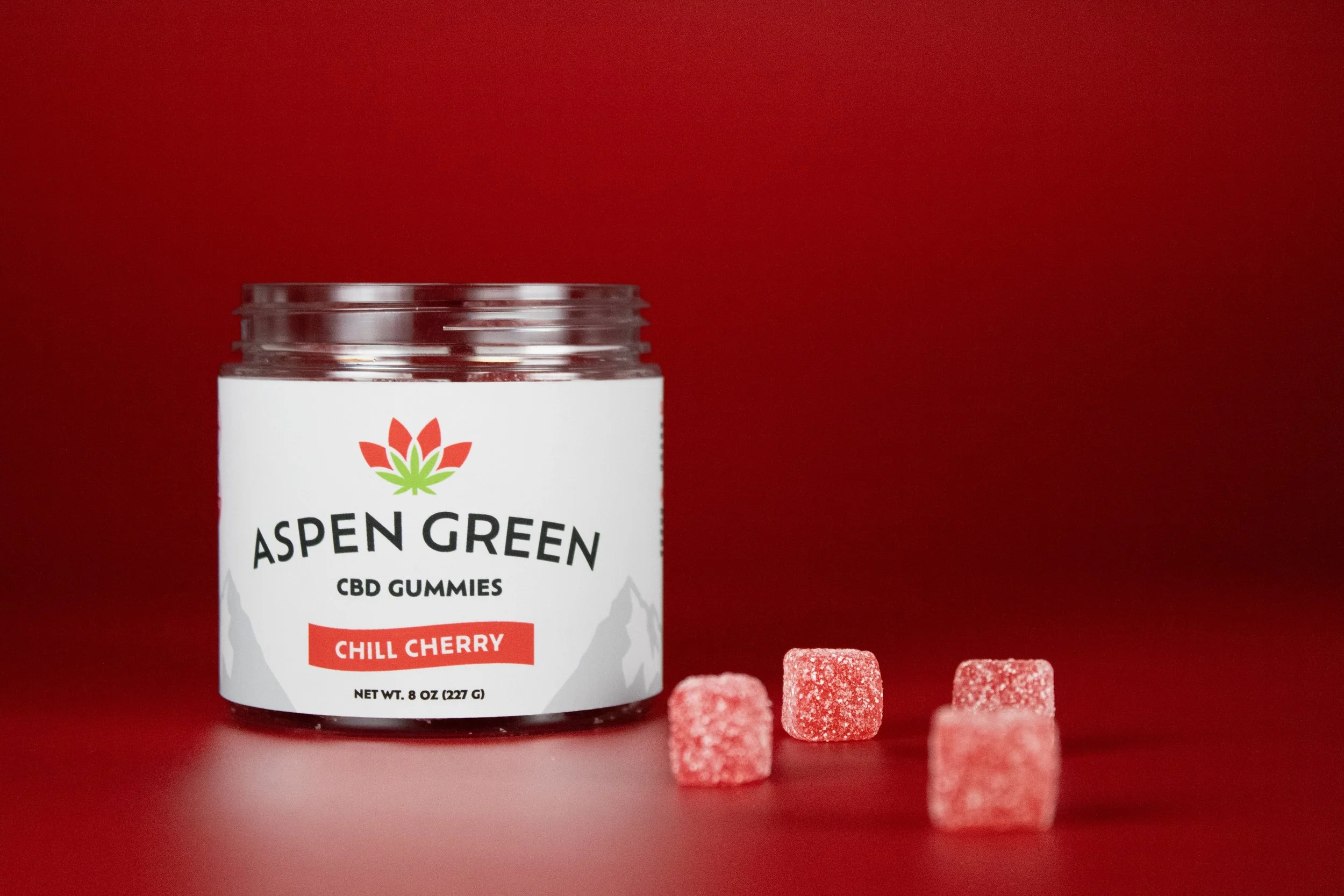
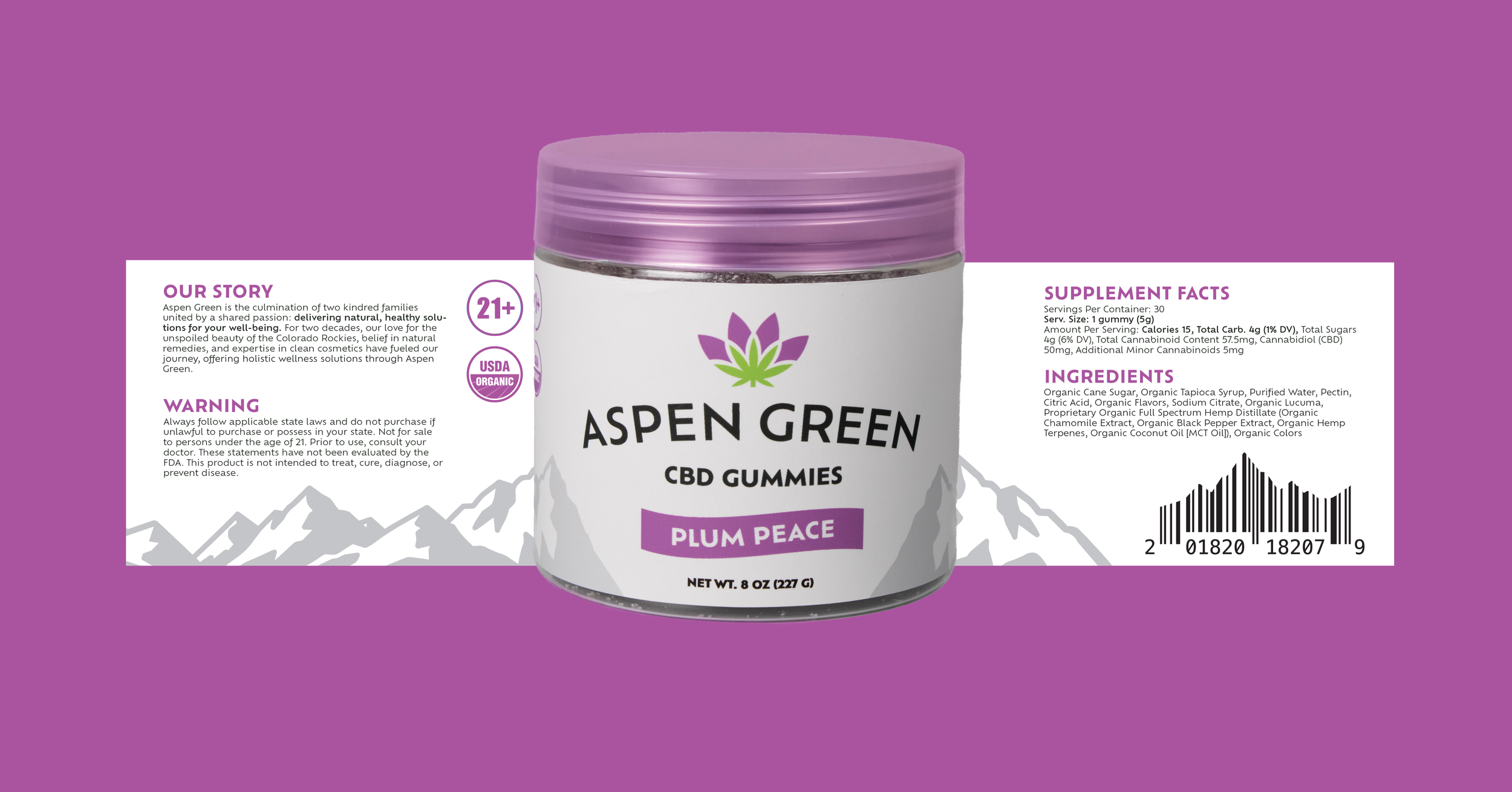
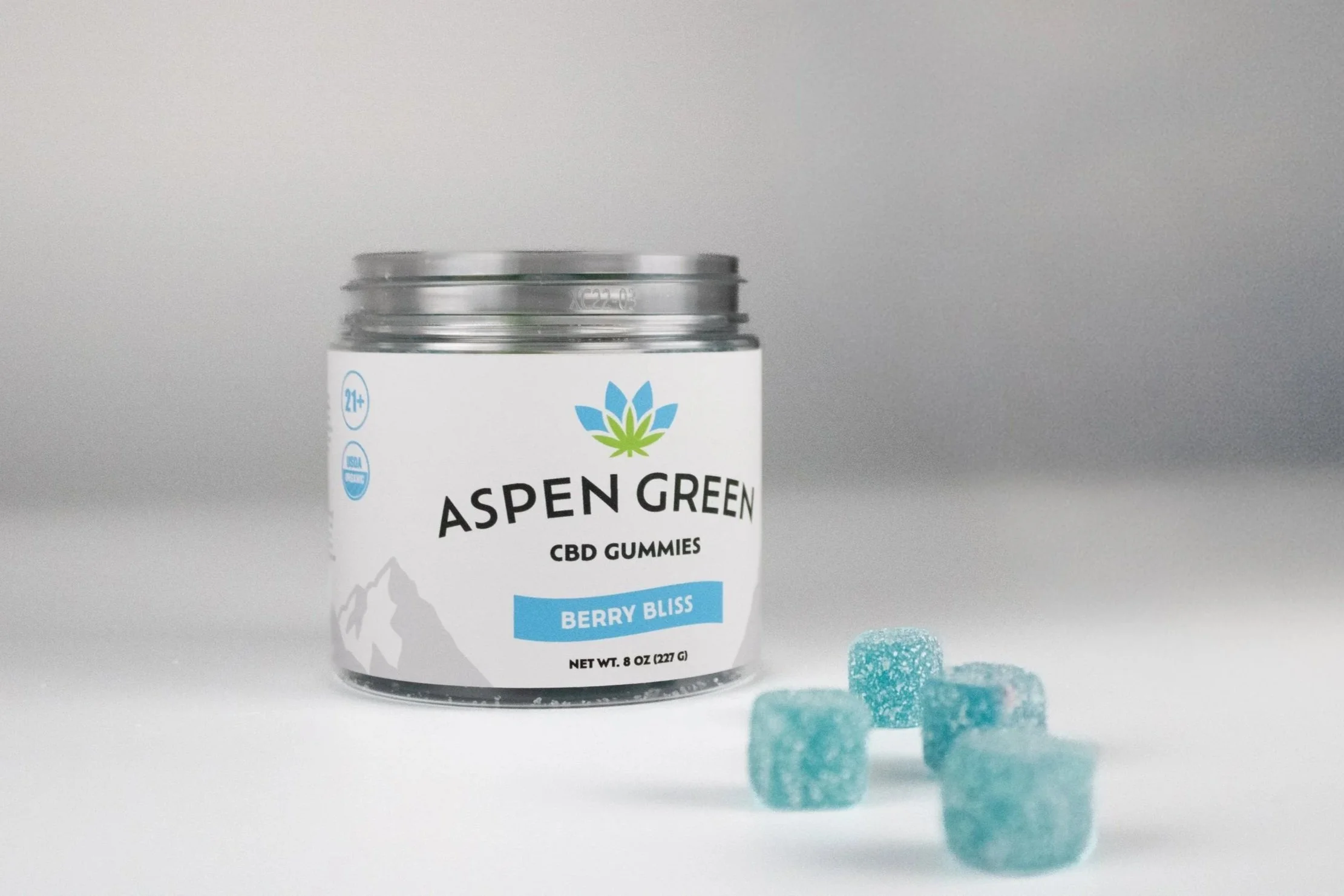
Rebrand for Aspen Green, a wellness company delivering natural, healthy solutions for your well-being. For two decades, Aspen Green’s love for the unspoiled beauty of the Colorado Rockies, belief in natural remedies, and expertise in clean cosmetics have fueled the journey of the company, offering holistic wellness solutions.
-
Project Approach
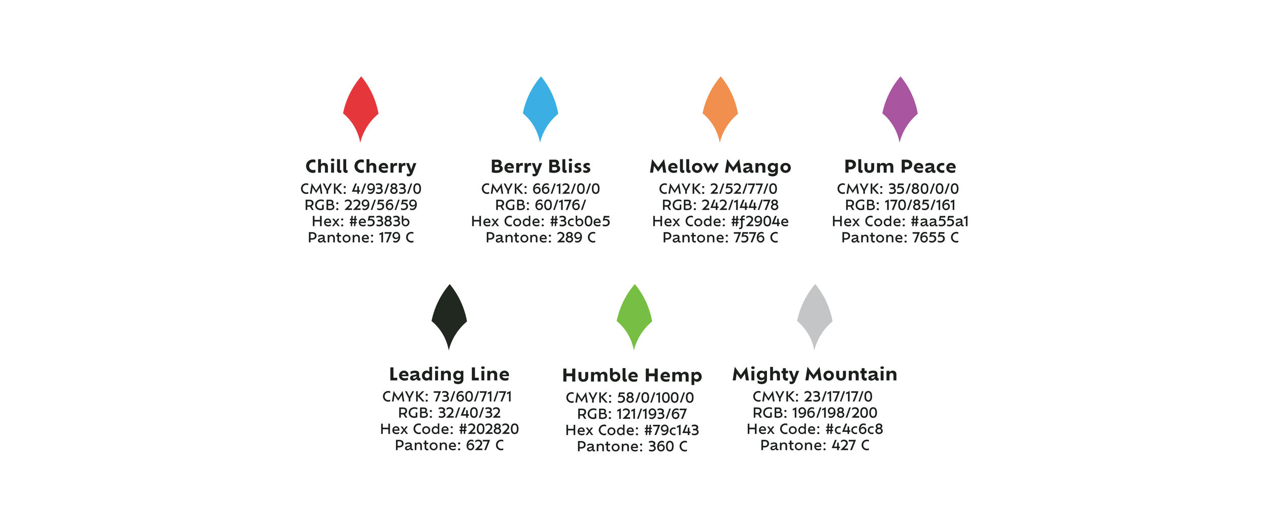
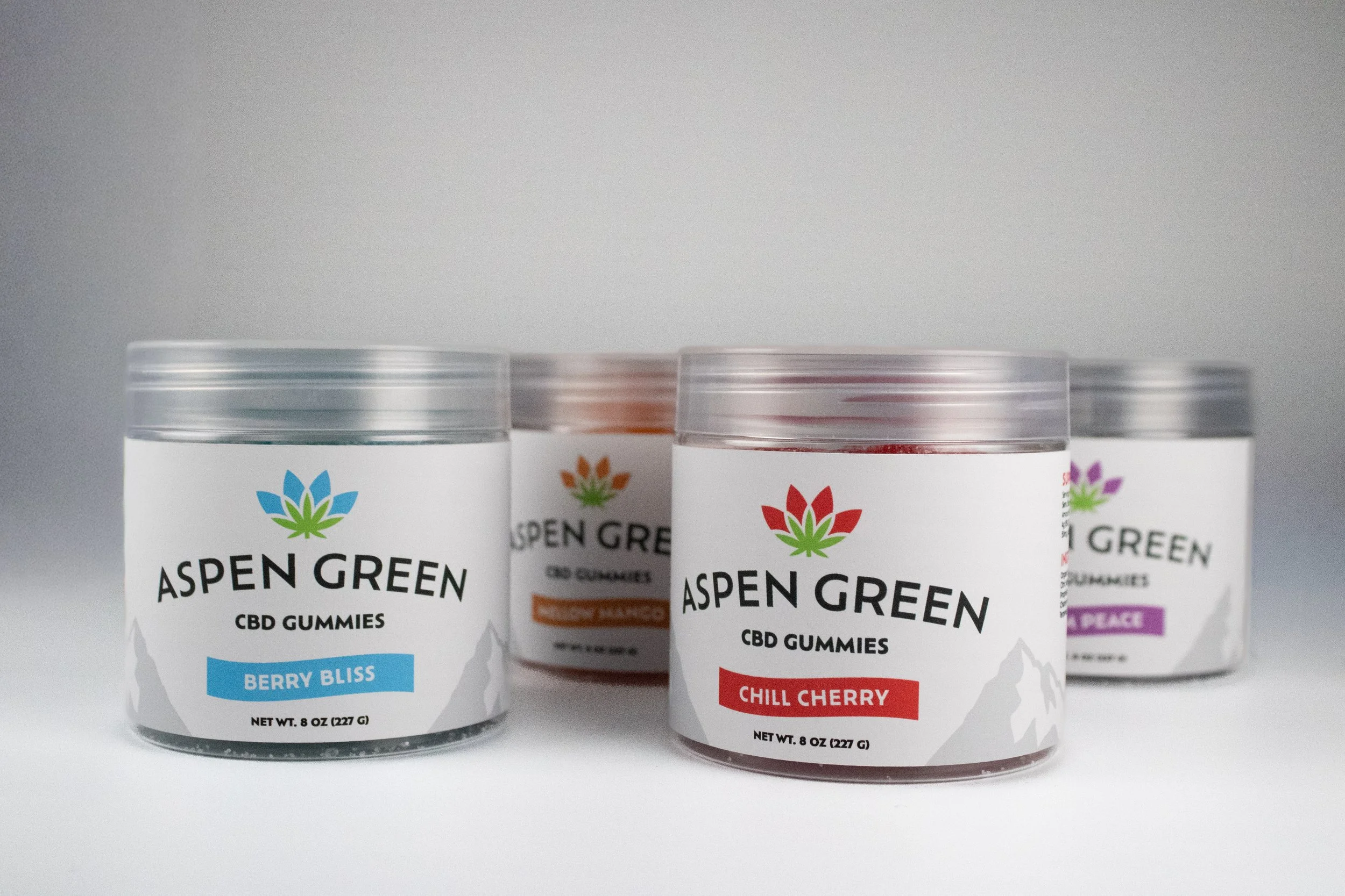
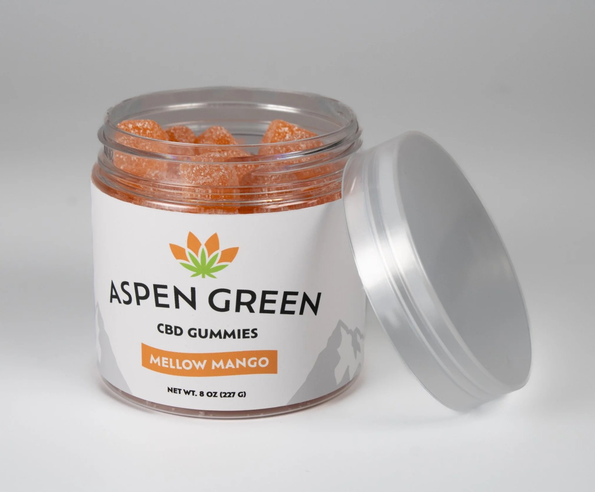
The Aspen Green project is aimed to redesign the current branding system for a wellness company located in Colorado, keeping the same clean aesthetic and values of the brand, but giving it a refresh. The approach revolved around combining floral imagery with that of the hemp leaf. By seamlessly blending the new iconography with the company’s identity, the goal was to create a rebrand that not only reflected the unique startup of the company consisting of two couples, but reassuring customers they are getting the clean, health conscience products they’ve been getting for years.
-
Brand Voice
Aspen Green’s voice is calm, credible, and reassuring - grounded in medical expertise and organic purity. We educate without jargon, build trust through transparency, and speak with quiet confidence, never hype. Every message reinforces safety, integrity, and care, helping people feel informed, supported, and confident in their wellness choices.